Nettle Studios Brand Refresh
Nettle Studios was built on a foundation of quality, style, inclusiveness and thoughtful fit, creating clothing that feels effortless, expressive and comfortable to live in. This new era of the brand introduces a more playful, cheerful and creatively expansive identity that reflects nettle’s evolving spirit. Inspired by the nettle studios community and their individuality and joy, this updated direction creates space for new forms of expression beyond apparel, including digital patterns, socks, accessories and more!
Personality
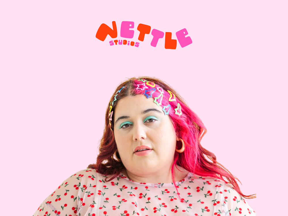
The Nettle Studios identity balances warmth, creativity and personal expression through playful visuals, tactile details and an approachable, transparent tone of voice. These new guidelines are meant to create structure for the brand, while still allowing creativity to shine through within that structure.
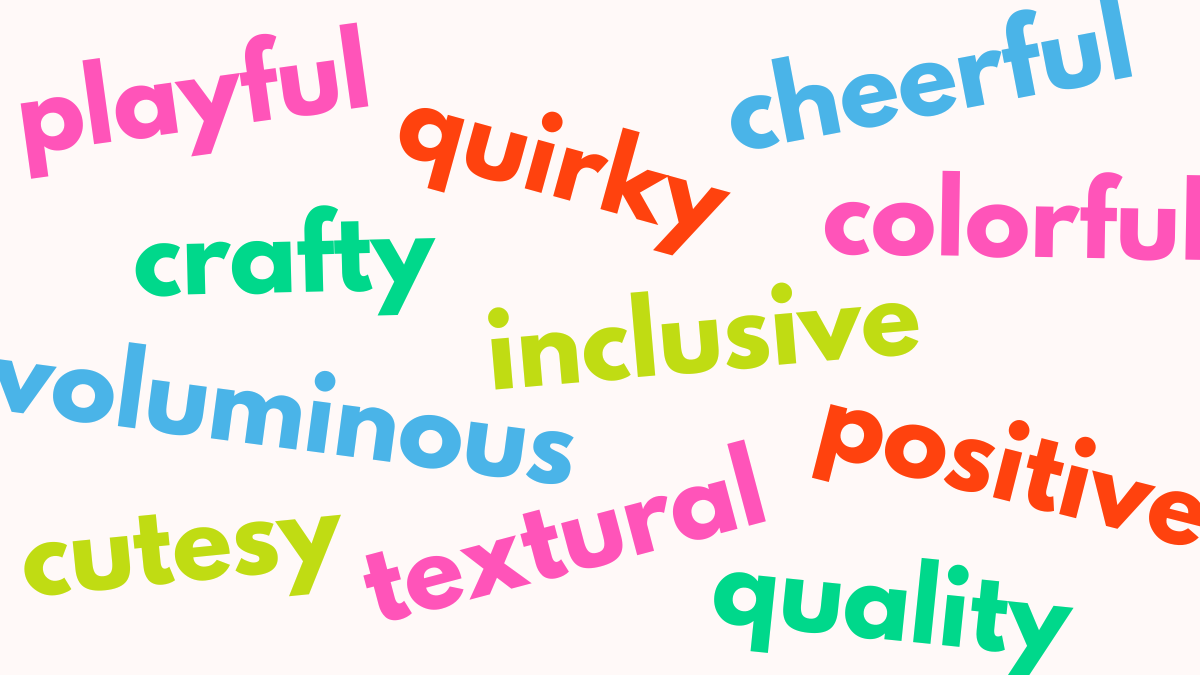
Nettle Studios is playful, inclusive, crafty, quirky, cheerful, voluminous, textural, positive, quality- focused, cutesy and colorful!

Logo Design Process Thumbnails
The Process
Here are some examples of logo ideas that were created during the design process. Each was created using custom typography or lettering. The goal was to incorporate the brand’s size inclusive vision with their playful attitude.
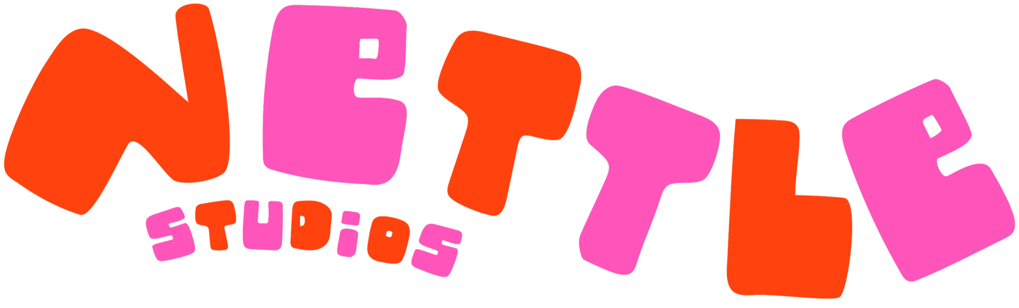
Primary Brand Logo
Alternative Logo
Simplified 2-Tone Logo

Wide Logo
Favicons


Pink Heart
Red Heart
Brand Initials
Red Tulip
Pink Tulip
Packaging and Print Materials
The brand wanted custom hang tags for their apparel line that included a main tag, a tag that explains their special ‘oversized’ size range, a ‘pre-shrunk’ tag to identify those items plus a fun sticker hang tag that customers could remove from the garment and however they want.
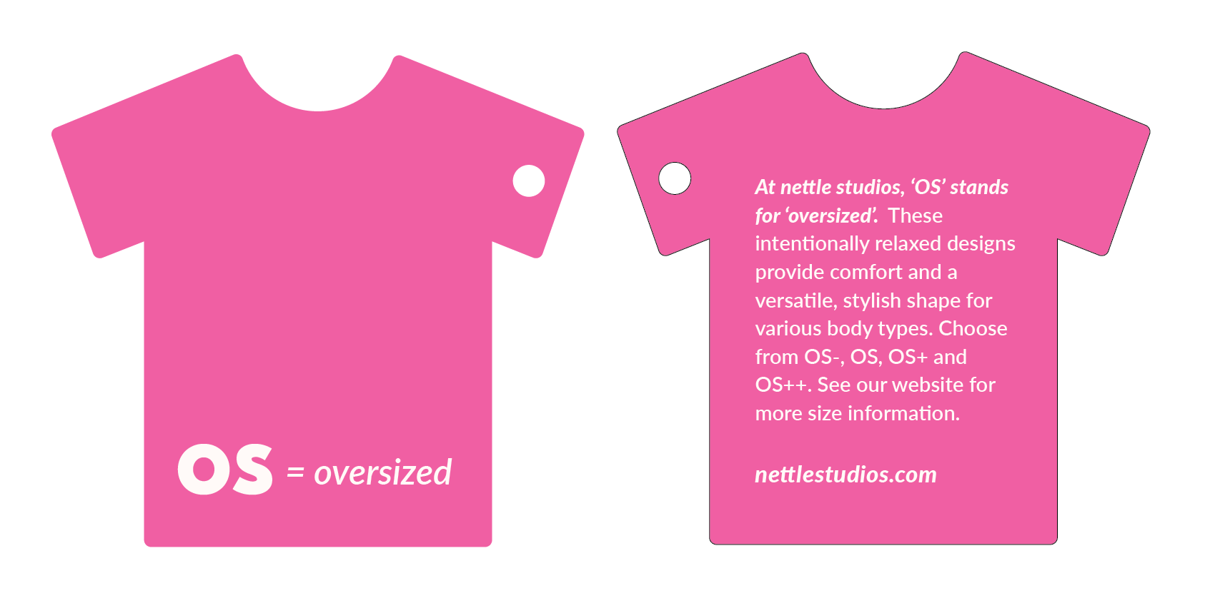
Hang Tag - Die Cut Shirt
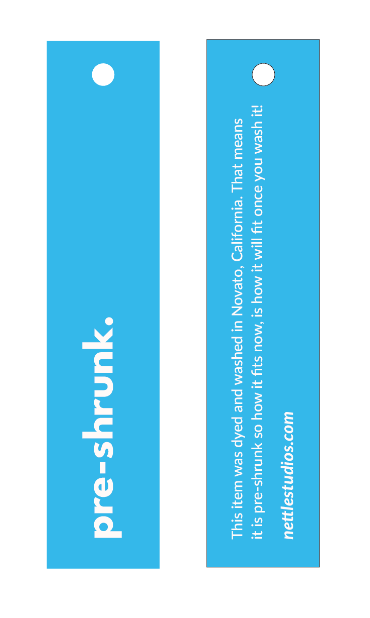
Hang Tag - Pre-Shrunk Apparel Tag
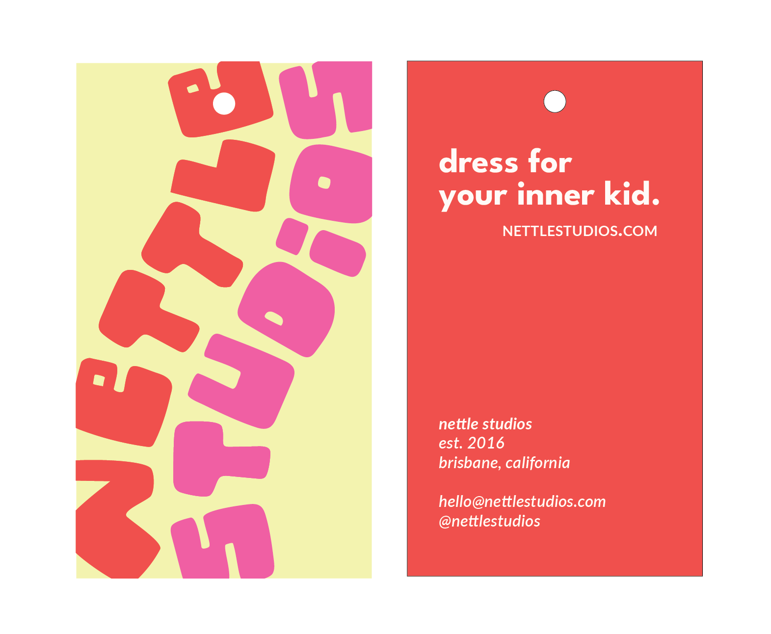
Hang Tag - Main Apparel Tag
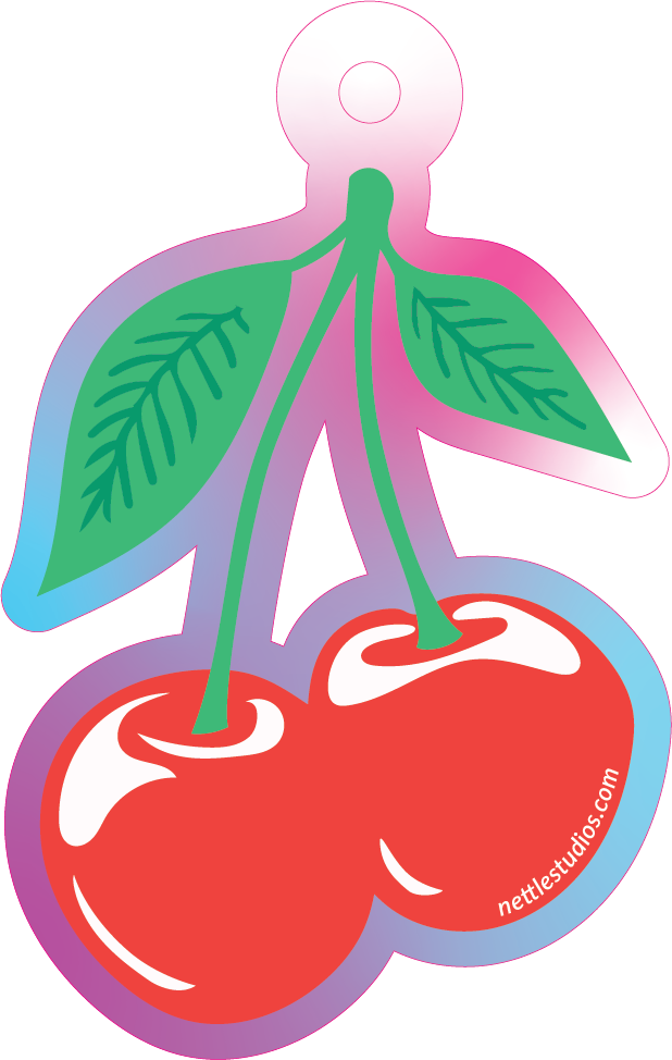
Hang Tag - Die Cut Holographic Sticker Tag